Ticket to Ride Website
Ticket to Ride
An award winning website rebuild for a Kentucky ride share program.

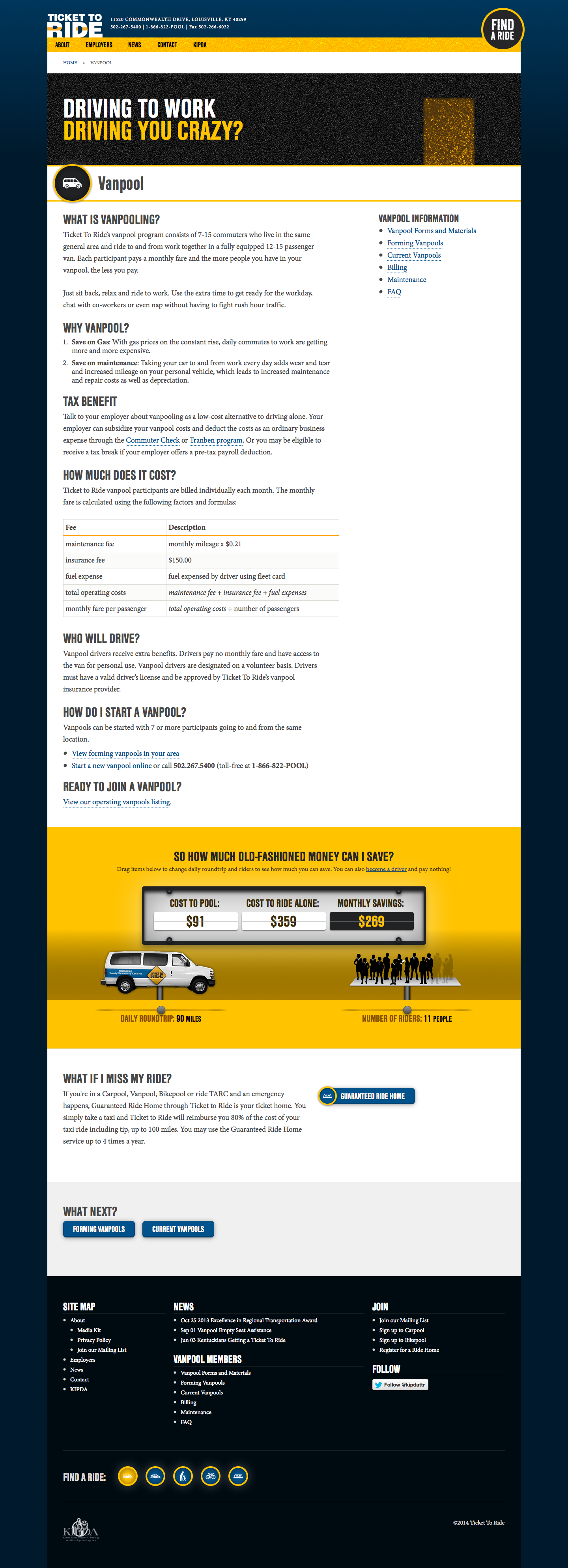
This project came to Red7e as a just make a few changes sort of project. A tight budget combined with a big fix-it list, made it more practical for a ground up rebuild. Not the easiest idea to sell to a client that had just gone through a site build.
The original site was chock full of broken links, duplicate content, hard coded content in templates and most the branded elements where done using Flash (in 2013 mind you). Worst of all the client could not use the CMS that the site ran on because it was set up so poorly and the training materials provided by the previous developer did nothing more than explain the login process.
The client had a fixed budget, any wasted effort would be out of our pockets not the clients. Patrick Hill, the art director and extra front end developer, and I decided to work almost entirely in browser to design this site. All comps that were passed to the client for sign off were in fact screenshots from our browsers. This let us iterate on the design without taking the extra steps necessary for a beast like Photoshop. We also were able to use our mockups as final production code.
I was in charge of cleaning up the content situation and getting the WordPress theme put together.
Page Template

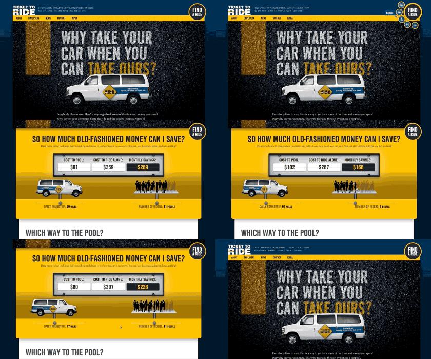
Cost Widget
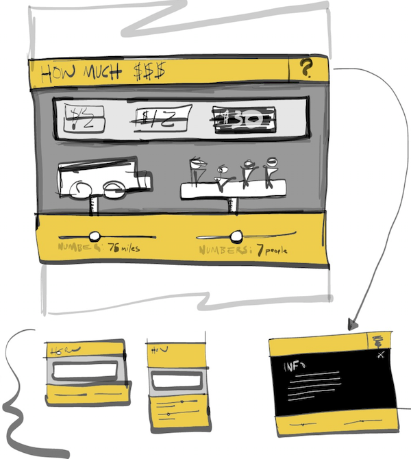
We were able to rebuild the site on WordPress quickly enough that we actually found ourselves with a handful of extra hours to spend. With our extra time we built custom navigation for the main Find a Ride menu. Patrick made the wheels turn on some of the van graphics and optimized the animations to keep 60fps. I set to sketching and we took what was a static HTML table on there old site and made a little interactive widget to calculate your estimated vanpool cost based on mileage and number of riders.
For the widget, I wrote the javascript and prepared the graphics while Patrick coded up my sketch and polished the tablet and phone versions of the layout.

Find A Ride Navigation
We wanted to simply a persons decision from 5-6 pool choices to one Find a Ride option. At some point the idea came up of having a single button that would show all the options on press. Patrick made a cool demo in Quartz Composer that had a set of little circle pop out of the larger button. We wanted to accomplish this in CSS not Javascript to keep load time down and keep browser support for dated browsers.
I build this little prototype so Patrick could adjust the sliders to find the best layout and then just copy and paste the CSS when he found a layout he like. CSS transitions took care of the animation parts for browsers that play nice. For the older ones absolutely positioned elements worked just perfect only without the smooth transition.
Circle Tool Example

If you would like to explore this further you can fork this code on Github.
Results Since Launch
At the end of the project, the client was able to update their own site again. We gave them a responsive site and even made training videos on how to use WordPress and the theme we build them.
- Moved to 1st page of google search results for ‘ticket to ride’
- Visits up 35%
- Unique visitors up 38%
- Page views up 25%
- Increase in contact/signup form conversion rates
The code for this site is W3C valid, Section 508 compliant and WCAG2 AAA compliant. To top it all off Red7e even won a Louie for the project.